
On being a design generalist and an intern at Dyte
The video calling startup was very different when I joined the team back in Sep 2020. I can say the same for myself. I had just begun exploring UI/UX and was ready to dive deeper, design for an actual product.
During Dyte’s YCombinator W21 seed funding phase, we were a small team with Akshay leading the design. Today, Dyte is backed by Sequoia & Nexus Venture Partners while part of the Surge 05 cohort.
My role in the team was flexible, and my desire to try out different things inspired me to write about it.
Social Media
Dyte had a different vision back when we were building a B2C video calling platform, and so it was important for customers to hear about the product. Marketing was essential. There were several responsibilities in maintaining a social media presence. Like ideating what to post, how frequently, and when.
One challenge was that we didn’t have much to talk about when Dyte was in its MVP stage. Prominent features only started to roll out later. So in the meantime, we designed posts about ‘the message’ we wanted to convey. “Zoom for India” and “hassle-free video calling” encompass that message.
Here are some IG posts I designed, which were also grounds for theme experimentation.
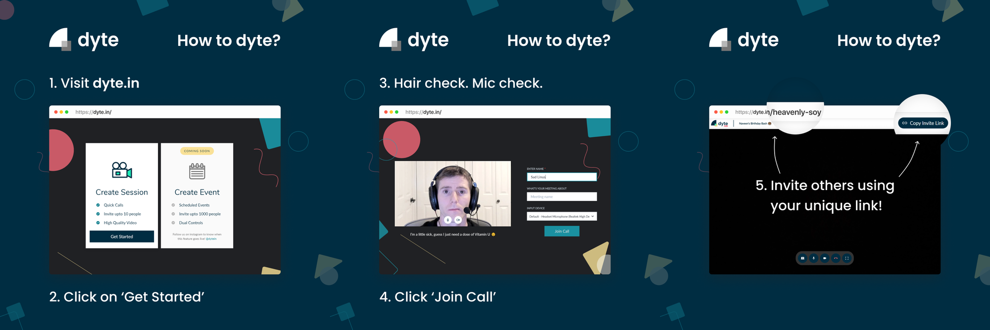
IG posts Design Experimentation
🙌 Takeaway: Knowing visual design principles goes a long way and is beneficial not just for marketing material but also across non-design applications. Making presentations, resumes, videos, emails, newsletters, literally any visual content can use an eye for aesthetics and good taste.
Brand Identity
Words might not be enough to convey a memorable message. Visual identity can invoke an emotion that users associate with a brand. It follows wherever the brand goes and is a backbone to other design aspects like illustrations, marketing, and UI.
When discussing the brand’s theme, I started to get ideas for the visual elements (to make stuff not so boring). My thought process was basically — “ok, so, Dyte. Video calling. Meetings. Presentations. Whiteboards. People. Markers. People with markers. Doodles? Yes! Doodles.”
I put my touch screen to good use and made these doodles related to meetings and presentations.

Combining with the theme, elements like these will always resonate with the product and can make it stand out from the competition.
When you realise that stuff from different design and non design areas, is interconnected and interdependent, all of a sudden, you find yourself doing stuff from said areas.
🙌 Takeaway: When starting, it's enough to have something simple in mind for the visual identity. It's better than not having anything because then the brand becomes forgettable.

Copywriting
How do you convey the value of your product and therefore persuade your visitors to try it out? Most of the landing page design is just text, and to increase the perceived value in the user’s eyes, great copywriting can help.
At first, we treated the landing page as a sales pitch. But then Dyte slowly pivoted to a B2B service that was also a consumer product at the same time. So that pitch got a little confusing.
In one design sprint, we set a meeting with everyone and asked them questions about Dyte itself. The answers gave a lot of content and ideas for the copy. Then, the best way to optimise it was to answer the following questions and set a single objective for our landing page.
- Who is the target demographic? Executives of product companies and developers.
- What is their problem? Integrating video calling into their app or website is a hassle.
- How does Dyte solve it? Dyte provides easy-to-implement, brandable audio and video SDKs.
“If you’re marketing to everyone, your message is resonating with no one.”
🙌 Takeaway: Even if your product can do things that interest ten different personas, you should streamline almost every aspect as much as you can to accomplish one goal.
Illustrations
If you’re expecting crazy humaaans-like illustrations, let me stop you right there. I’m not an illustrator; I usually design whatever’s around the illustration. It’s like being a musician who can’t sing. Not that I’m a musician or a singer, but you get my point, right?
Remember those simple doodles above I made earlier? Using those, I created illustrations associated with the features we were bringing to Dyte.

In some places, the illustration had to explain the feature in more fidelity. So I made these composite-like illustrations later too.

🙌 Takeaway: Try new things.
Video compositions
With the copy, letting the user visualise value through images/videos is an effective way to showcase product features. So we made demo videos that show how the user can interact with the web app.
One of them I made in Protopie 👇
The feature: work together in the same window alongside video calls.
The composition:

UI Designs
I’ll leave this here without any context like dribbble…

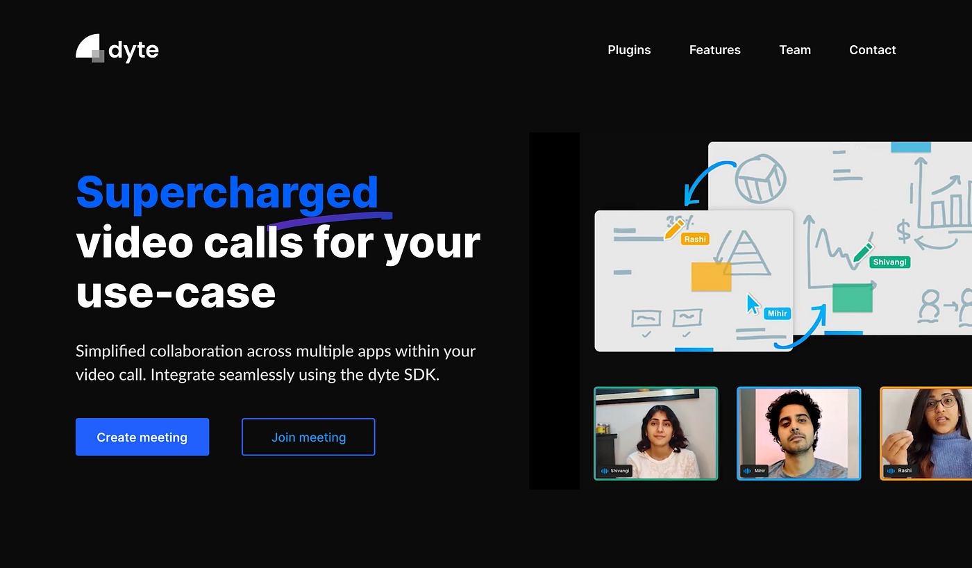
Webflow
We went no-code for the landing page, and it was an excellent decision. Webflow allowed us to ‘develop’ and host the website in a matter of a few days.

However, you’re constrained by the tools you use. So before buying a subscription, see if there’s anything you want that Webflow can’t do. But again, Webflow allows you to export code too, so it might be possible to add whatever you want later.
Front-end styling
During the design handoff, it’s not unusual to see that UI components in React don’t look like how they do in Figma. If you spot these visual inaccuracies and know just enough front-end dev, you can fix them right away! Akshay, Rishit and Rohan were really helpful and guided me whenever I was stuck.

🙌 Takeaway: Knowing some frontend development is enough to understand and edit code that devs wrote (if that’s something you want to do). Plus, it helps design folks have an idea of what’s implementable and get better at designer-developer collaboration.
Writing
This is getting meta now. The more I design, the more I want to write about it. When I’m writing (and struggling to write), I retrospect on my thought process. I then slowly start to understand how I think. And when you know how you think, you’ll learn to think better when solving UX problems. Writing is like design therapy.
Closing thoughts
What’s cool about design is that it’s not nearly as complicated to get started in a range of skills. Being a generalist is great. You can create value for almost any business out there. However, at some point, you’d probably want to pick a speciality you incline towards.
To figure that out, you first need to push yourself into new situations until you find your inclination. I hope you find yours if you haven’t already.
Thanks for reading :)


